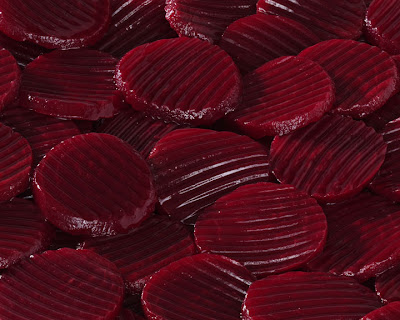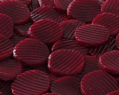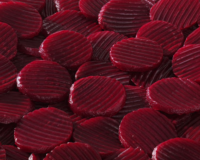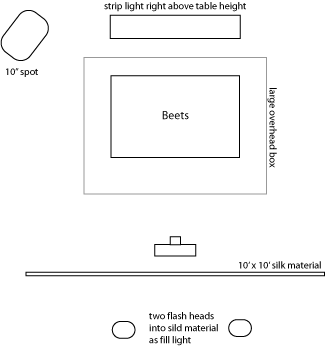
I probably shot 30 images before we got the composition and lighting that we finally settled on, but here are 3 images that basically illustrate the lighting choices available to us.

I first started out with a relatively small light source at a relatively high light ratio. I felt as though the highlights were too strong and the shadows were too dark. While we were on the right track, the light ratios were just not right yet.
In the second image, I added some light from on top of the set to “fill in” the shadows, but we just weren’t happy with the way the added light seemed to wash out and de-saturate the color of the beats. The lighting challenge was how to lighten the beets without taking away the color.

In the final image, we ended up lessening the overhead light and adding fill cards all around the set in order to add light from everywhere and at the same time making the light seem to come nowhere. Yes, there is a light direction. You need to have that in order to show texture and shape, but now this is just enough glare in order to relieve the shadows without taking away the color. How did I come upon the correct light ratio? Trial and error. To be a good photographic lighter, you have to be able to SEE what’s there and then figure out how to MAKE it into what you want it to be. If it has too much glare, lessen that light. It the shape is weak, move the light until you get more shape. It’s trial and error.


No comments:
Post a Comment